[Flutter] Button 종류 변경
반응형
참고
https://docs.flutter.dev/release/breaking-changes/buttons
New Buttons and Button Themes
The basic material button classes have been replaced.
docs.flutter.dev
기존 플러터에서는
FlatButton,Outline Button,RaisedButton
3가지의 버튼을 사용했다.
각 버튼은 플러터 버전에 따라서 사용을 못하는데, 개별 스타일테마 적용에서 공용스타일테마 적용을 위해서라고 한다.
아무튼 변경된 버튼별 사용 예를 첨부한다.
Flatbutton ▶TextButton

TextButton(
style: TextButton.styleFrom(
shape: StarBorder(),
primary: Colors.blueGrey,
onSurface: Colors.blueGrey),
onPressed: () {
print('Pressed TextButton!');
},
child: Text('TextButton'),
),
TextButton(
style: ButtonStyle(
backgroundColor:
MaterialStateProperty.all(Colors.cyanAccent)),
onPressed: () {
print('Pressed TextButton!');
},
child: Text('TextButton'),
),
OutlineButton▶OutlinedButton
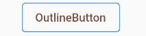
OutlinedButton(
style: OutlinedButton.styleFrom(
primary: Colors.brown,
side: BorderSide(color: Colors.blueAccent)),
onPressed: () {
print('Pressed OutlinedButton!');
},
child: Text('OutlineButton'),
)
RaisedButton ▶ElevatedButton
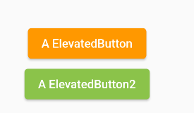
ElevatedButton(
style: ButtonStyle(
backgroundColor: MaterialStateProperty.all(Colors.orange),
foregroundColor: MaterialStateProperty.all(Colors.white)),
onPressed: () {
print('Pressed ElevatedButton!');
},
child: Text('A ElevatedButton')),
ElevatedButton(
style: ElevatedButton.styleFrom(
primary: Colors.lightGreen, onPrimary: Colors.white),
onPressed: () {
print('Pressed ElevatedButton2!');
},
child: Text('A ElevatedButton2')),
반응형
'Study > Flutter' 카테고리의 다른 글
| [Flutter] GestureDetector Widget (0) | 2023.02.03 |
|---|---|
| [Flutter] 플로팅 버튼 중단부에 위치시키기 BottomApp, Floationg Action (0) | 2023.02.02 |
| [Flutter] Sqlite를 구현하는 Drift (0) | 2023.01.30 |
| [Flutter] Widget을 밀어서 삭제하는 Dismissible (0) | 2023.01.27 |
| [Flutter] gradle 버전 이슈 (0) | 2023.01.25 |


댓글